Name Badge Design: Layout & Typography That Reads Across a Room
Good name badge design is not about looking clever up close — it is about being read correctly from several feet away by someone who is not trying very hard. At a trade show, conference, or hospital floor, a badge usually has less than a second to communicate a name before the reader’s eyes move on to the handshake. Get the layout and typography wrong and even an attractive badge fails at the one job it has.
This guide walks through the practical side of name badge design: how large the name needs to be to read at a typical conversation distance, which elements deserve the most visual weight on a crowded badge, and how color and contrast choices change legibility far more than most people expect when they are picking a template.
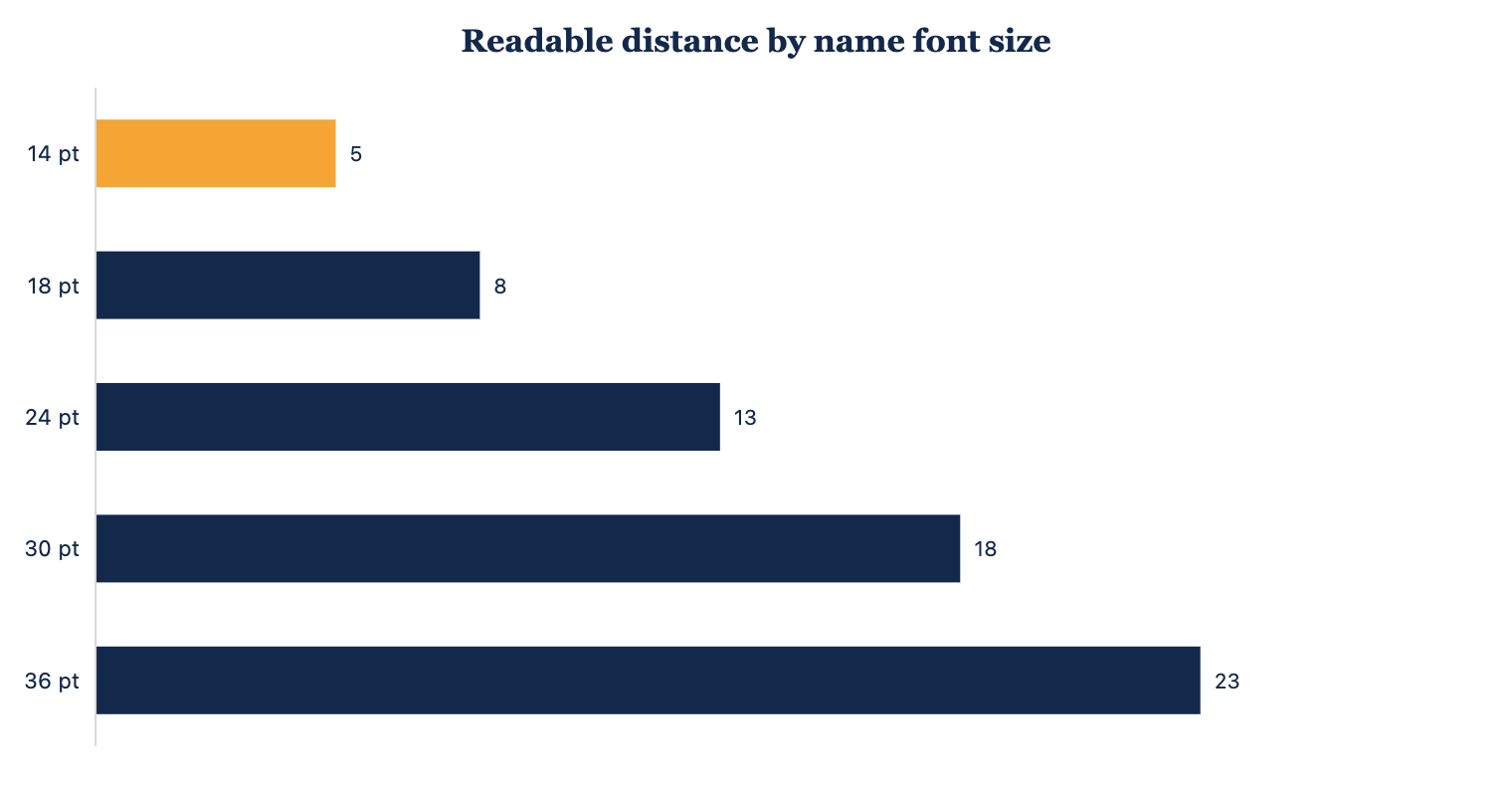
Why legibility distance is the real design brief
Before you pick a font or a layout, decide how far away the badge needs to work. A badge worn at a seated desk only needs to read at arm’s length, but a badge worn at a networking mixer needs to read from across a small circle of people, typically somewhere in the 6 to 10 foot range. That single decision should drive every other choice on the badge, because a name sized for a desk will disappear on a trade show floor, and a name sized for a crowded hall will look oversized in a one-on-one meeting.
Font size in points does not translate directly to feet
A common mistake is assuming a slightly bigger point size automatically means a proportionally bigger legibility gain. In practice the relationship is closer to a curve than a straight line: moving from a cramped 14 pt name up to 18 pt buys a meaningful jump in readable distance, and continuing up toward 30 or 36 pt keeps extending that distance, but with diminishing headroom once the badge itself runs out of physical space. Badges are typically 3 by 4 inches or smaller, so there is a hard ceiling on how large text can go before it forces every other element off the card.
The layout hierarchy that actually works
Once size is settled, the next question is what earns the most visual real estate. The name should almost always be the largest, boldest element on the badge, because it is the single piece of information every reader is scanning for. Everything else — job title, department, company logo — exists to support that name, not compete with it.
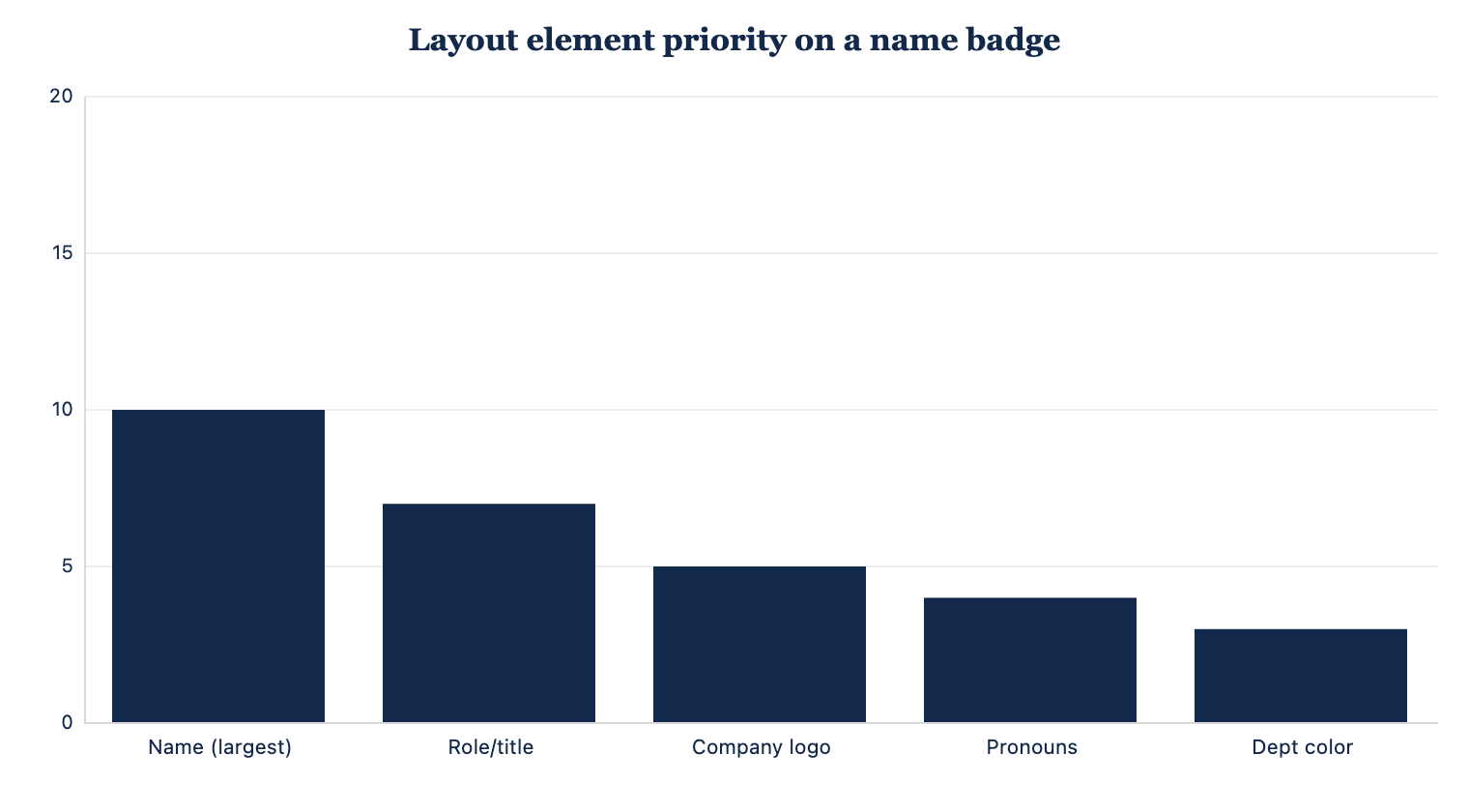
Role or title typically ranks second, since it gives context for the conversation that is about to happen, followed by a company logo that reinforces brand recognition without pulling focus from the name itself. Pronouns and department color-coding round out the hierarchy; they matter for inclusivity and quick sorting at a glance, but they should stay visually quiet compared to the name.
Where color and contrast matter
Contrast does more work than color choice alone. Dark navy or near-black text on a light background reads faster under fluorescent lighting than light text on a mid-tone color, even if the mid-tone version looks more polished in a mockup. If a badge uses a colored bar or department stripe, keep it away from directly behind the name text, since busy backgrounds are one of the fastest ways to erase the size advantage you just built into the font.
| Badge element | Typical size range | Design note |
|---|---|---|
| Name (first + last) | 24-36 pt | Largest, boldest element on the card |
| Job title / role | 12-16 pt | Secondary weight, one line if possible |
| Company / logo | 0.5-1 in wide | Top or bottom band, not center-competing |
| Pronouns | 9-11 pt | Small, near name, optional per event |
| Dept / color code | Bar or dot | Edge accent, never behind name text |
Choosing typefaces for name badges
Simple, well-spaced sans-serif fonts consistently outperform decorative or script fonts at badge distances. Letterforms with open counters — the closed spaces inside letters like “a,” “e,” and “o” — stay legible at small sizes better than condensed or overly stylized faces. Save script or brand-specific display fonts for the logo, and let a clean workhorse font carry the name.
Weight, spacing, and case
A medium or semi-bold weight is usually the sweet spot: regular weight can look thin and washed out under bright event lighting, while a heavy or black weight can start to blur letter shapes together at small sizes. Letter spacing should be slightly loosened rather than tightened, since tight tracking is one of the most common causes of names that blur into a single shape from a distance. Mixed case (not all capitals) is generally easier to scan quickly, because word shape helps the eye recognize a name faster than a uniform block of capital letters.
Adapting layout to how the badge is worn
A lanyard badge, a clip-on badge, and a magnetic badge all hang or sit slightly differently on a person, and that changes what part of the card is easiest to read at a glance. A lanyard badge tends to angle and swing, so keeping the name centered rather than pushed to one edge helps it stay legible even when the badge is not perfectly straight. A magnetic badge sits flatter and higher on the chest, closer to eye level for most people, which is part of why it consistently tests as easier to read across a short conversational distance than a badge hanging lower on a cord.
Vertical vs horizontal orientation
Horizontal badges give a wider canvas for a name and title to sit on one line each, which is usually easier to scan than a narrow vertical badge that forces a long name to wrap. Vertical badges can still work well when the layout leans into the shape, stacking name, title, and logo in a clear top-to-bottom order rather than trying to force a horizontal layout into a tall card. Whichever orientation you choose, keep the same hierarchy rules in place: name largest, everything else smaller and clearly subordinate.
Common name badge design mistakes
The most frequent error in badge design is treating every element as equally important, which usually means shrinking the name to make room for a logo, a tagline, and a QR code all on one small card. A second common mistake is low-contrast color pairings chosen for brand aesthetics rather than readability, such as a light gold name on a white background. A third is over-condensing text to fit a long name or title, which sacrifices the exact legibility the badge exists to provide. Thoughtful name badge design means being willing to cut secondary information before shrinking the name.
Bottom line
A badge that reads well across a room comes down to a short list of decisions made in the right order: pick a target reading distance, size the name accordingly, give it the clearest hierarchy and highest contrast on the card, and choose a simple, well-spaced typeface over a decorative one. Handle those basics and the rest of the layout falls into place naturally.
Get badges designed for readability
Tell us your event size and typical reading distance and we will lay out badges that read clearly from across the room.
Get a QuoteHome · About · Buying guides · Companion guide: reusable vs disposable name badges